Designing the creator economy from zero to one
Designing the creator economy from zero to one
How I designed Feeding Trends - the first unified platform that takes creators from content to entrepreneurship through community-driven recognition
How I designed Feeding Trends - the first unified platform that takes creators from content to entrepreneurship through community-driven recognition
My role: Sole Product Designer
My role: Sole Product Designer
Timeline: May - Nov 2024
Timeline: May - Nov 2024
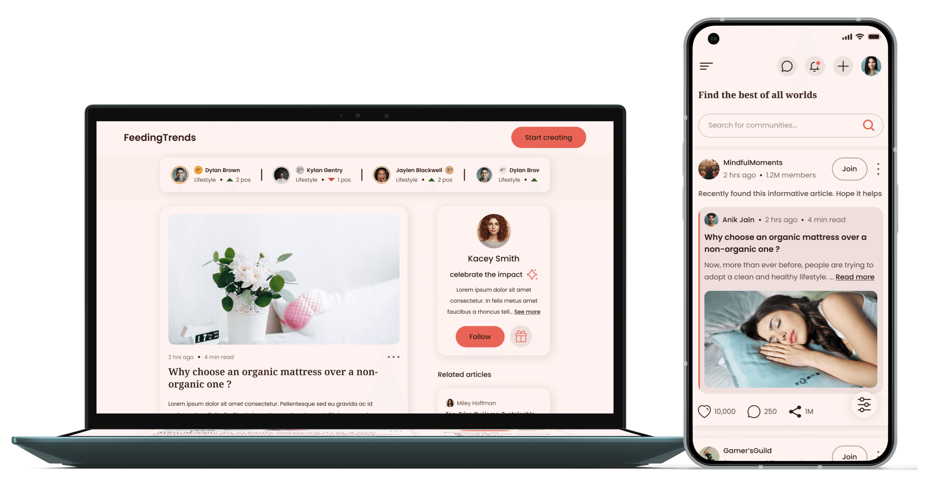
The product: Feeding Trends lets creators publish articles, grow a community, earn recognition, and unlock commerce tools, all in one place.
The product: Feeding Trends lets creators publish articles, grow a community, earn recognition, and unlock commerce tools, all in one place.
Constraints: Due to a tight timeline and budget, I adapted my research strategy using secondary data and stakeholder input.
Constraints: Due to a tight timeline and budget, I adapted my research strategy using secondary data and stakeholder input.
It's gonna be long, grab some coffee
It's gonna be long, grab some coffee
Tap tap !
Tap tap !
The Problem
The creator economy is fragmented and creators today need multiple platforms to succeed:
Medium/Substack for content
Patreon for monetization
Discord for community
Shopify for products
LinkedIn for professional networking
What if there was ONE platform for the entire journey?
The creator economy is fragmented and creators today need multiple platforms to succeed:
Medium/Substack for content
Patreon for monetization
Discord for community
Shopify for products
LinkedIn for professional networking
What if there was ONE platform for the entire journey?
The Solution
Feeding Trends: The unified creator economy
Create content → Earn karma points from impact
Rank top 2% in a category → Get paid by platform
Build authority → Sell products/services
Grow community → Launch your business
All powered by community-driven recognition (karma points [described further down])
Feeding Trends : The unified creator economy
Create content → Earn karma points from impact
Rank top 2% in a category → Get paid by platform
Build authority → Sell products/services
Grow community → Launch a business
All powered by community-driven
recognition (karma points [described further down])
What did the product need?
What did the product need?
Feeding Trends wanted to add four new features: Goals, Commerce, Communities, and Opportunities.
These features aimed to help users move from
READERS → CREATORS → INFLUENCERS → BUSINESS OWNERS
READERS → CREATORS → INFLUENCERS → BUSINESS OWNERS
The goal was to keep the platform fun and engaging while also giving businesses ways to sell and grow.
Why were these necessary?
Why were these necessary?
To support the platform’s growth goals, the product needed to appeal to a broader range of users. The stakeholders had identified four key user segments that the platform aimed to serve:
Readers
Readers
Individuals who primarily visit to consume knowledge-rich content and explore topics of interest
Creators
Creators
Users who actively write articles and share insights or stories with the community
Users who actively write articles and share insights or stories with the community
Influencers
Influencers
Well-established content creators who often build and lead niche communities or run collaborative campaigns
Businesses
Businesses
Brands or entrepreneurs looking to promote, sell, or offer digital services/products through the platform
My Approach for Startup Setting
My Approach for Startup Setting
Flexible hybrid process: Design Thinking × Lean UX
Prioritized speed, collaboration and outcome-driven iterations
Relied on stakeholder personas, UX heuristics and competitor audits
Worked non-linearly but always toward clear user and product goals
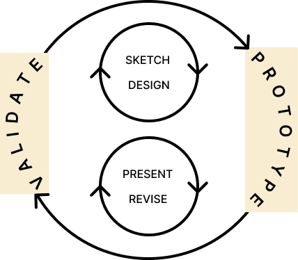
Figure : The Lean UX cycle shown here is adapted from the Interaction Design Foundation. I used this model as the basis for my flexible design process, focusing on iterative delivery and stakeholder feedback
Figure : The Lean UX cycle shown here is adapted from the Interaction Des… Read more
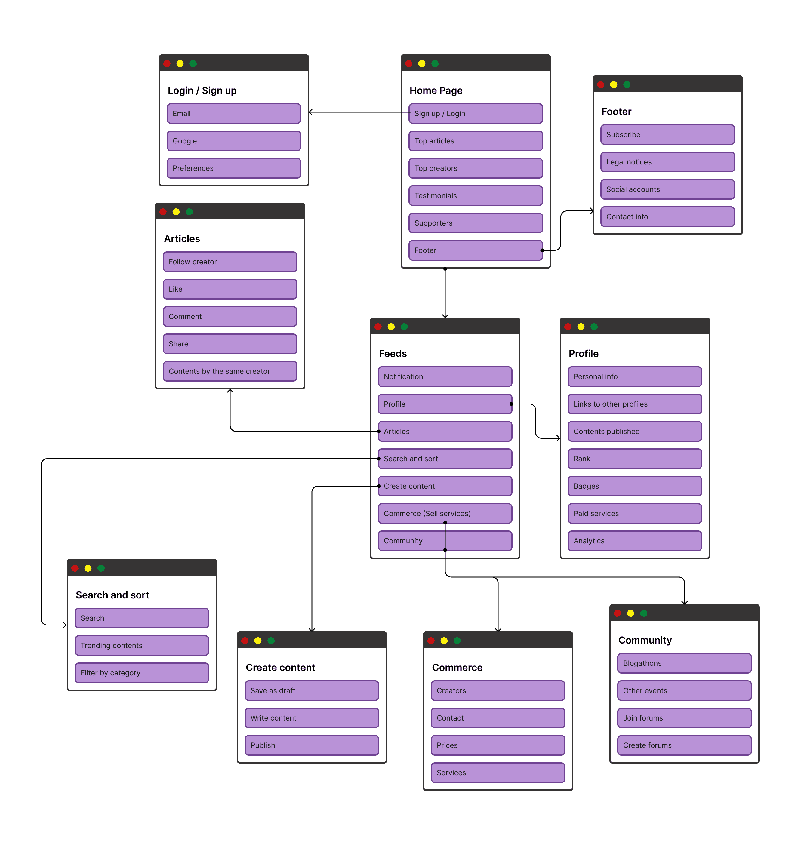
Figure : Initial sitemap showing the core structure and user flow foundations
Starting the Design
Starting the Design
To move quickly, I started with rapid sketches and wireframes to align on user flows and structure before refining visuals.
Figure : Low-fidelity wireframes for fast stakeholder alignment before diving into visual design
Figure : Mid-phase sketches used to quickly shape evolving features like Community spaces and digital storefronts
Goal 1 : Hook early adopters (18% target audience) within seconds.
Goal 1 : Hook early adopters (18% target audience) within seconds.
Web
Mobile
📌Objective: Immediate brand positioning + call to action.
💡Design Insight: Clear headline (“Be the trendsetter”) with a concise description and CTA.
🧭UX Strategy: Delivers purpose and urgency in <5 sec.
📌Objective: List benefits in a digestible format.
💡Design Insight: Icons + short copy for scannability.
🧭UX Strategy: Visually guides the user to tangible benefits.
📌Objective: Build user trust with real examples.
💡Design Insight: User photos + Tags simulate social proof.
🧭UX Strategy: Uses Social Proof to reduce skepticism.
📌Objective: Demonstrate activity and inclusivity.
💡Design Insight: Community cards & member count reinforce platform usage.
🧭UX Strategy: Leverages the “Bandwagon Effect”.
📌Objective: Final trust push through content quality.
💡Design Insight: Category visuals & article counts.
🧭UX Strategy: <bounce rate by interest-based exploration.
Details on how I improved brand color accessibility in this Medium write-up.
Details on how I improved brand color accessibility in this Medium write-up.
Impact : Early designs reduced bounce and increased click-through from hero CTA by highlighting trust and engagement upfront.
Goal 2 : Make it easy for users to find and use new features by designing clear navigation and smooth transitions between different parts of the platform.
Goal 2 : Make it easy for users to find and use new features by designing clear navigation and smooth transitions between different parts of the platform.
Iteration 1
Iteration 2
In context
Mobile
To keep things clean and intuitive, I created the following things :

Figure : A simple top navigation bar for universal actions — like search, profile and notifications

Problem
As new features were added, the original fixed sidebar navigation couldn’t scale.
Key additions like:
Communities (join/create)
Digital products & services
Opportunity Hub (jobs, events, campaigns)
...led to multi-layered, complex ecosystems.
Approach
Audited platforms like Quora, Reddit, and Notion to study how they manage depth.
Gathered stakeholder feedback → Clear need for scalable, intuitive navigation.
Redesigned from scratch, focusing on:
Scalability, Clarity, Smooth user flow across all new features
Figure : A vertical sidebar for core sections like Home, Community, Trending, Commerce, and Opportunity
Iteration 2 presents a refined design, developed using a clear approach, to address the challenges uncovered in Iteration 1.
Iteration 1
Iteration 2
In context
Mobile
To keep things clean and intuitive, I created the following things :
Figure : A simple top navigation bar for universal actions — like search, profile and notifications
Problem
As new features were added, the original fixed sidebar navigation couldn’t scale.
Key additions like:
Communities (join/create)
Digital products & services
Opportunity Hub (jobs, events, campaigns)
...led to multi-layered, complex ecosystems.
Approach
Audited platforms like Quora, Reddit, and Notion to study how they manage depth.
Gathered stakeholder feedback → Clear need for scalable, intuitive navigation.
Redesigned from scratch, focusing on:
Scalability, Clarity, Smooth user flow across all new features
Figure : A vertical sidebar for core sections like Home, Community, Trending, Commerce, and Opportunity
Iteration 2 presents a refined design, developed using a clear approach, to address the challenges uncovered in Iteration 1.
Impact : Reduced user confusion and improved discoverability across 5+ new ecosystems like Opportunities, Events, and Commerce.
Goal 3 : Design a feed to increase retention across diverse content types (articles, videos, goals, achievements).
Goal 3 : Design a feed to increase retention across diverse content types (articles, videos, goals, achievements).
Iteration 1
Iteration 2
Feed page
Started with sketching a familiar solution: a card-based layout inspired by Medium.
Chose this approach because the platform’s primary content format was articles.
The layout felt clean, minimal and focused — ideal for a reading-heavy interface.
Created wireframes based on this concept.
Received positive feedback from stakeholders, especially on the clarity and hierarchy of the layout.

Figure : Low fidelity card wireframe
Figure : Medium article card layout
Problem
Medium’s design was effective for article-based content.
However, the platform was expanding to support videos, community posts, goals and user achievements.
Feedback from the developer team highlighted that creating separate card layouts for each content type would be resource-intensive and hard to maintain.
Realized the need for a more versatile card system.
The goal was to design a single, scalable layout that could handle all content types without sacrificing visual harmony or user experience.
Iteration 2 presents a refined design, developed using a clear approach, to address the challenges uncovered in Iteration 1.
Iteration 1
Iteration 2
Feed page
Started with sketching a familiar solution: a card-based layout inspired by Medium.
Chose this approach because the platform’s primary content format was articles.
The layout felt clean, minimal and focused — ideal for a reading-heavy interface.
Created wireframes based on this concept.
Received positive feedback from stakeholders, especially on the clarity and hierarchy of the layout.
Figure : Low fidelity card wireframe
Figure : Medium article card layout
Problem
Medium’s design was effective for article-based content.
However, the platform was expanding to support videos, community posts, goals and user achievements.
Feedback from the developer team highlighted that creating separate card layouts for each content type would be resource-intensive and hard to maintain.
Realized the need for a more versatile card system.
The goal was to design a single, scalable layout that could handle all content types without sacrificing visual harmony or user experience.
Iteration 2 presents a refined design, developed using a clear approach, to address the challenges uncovered in Iteration 1.
Impact :
Boosted engagement time and reduced session drop-offs
Maintained design consistency while reducing dev overhead
Goal 4 : Design a Karma Points system enabling progression in rank, recognition, and earning potential on the platform.
Goal 4 : Design a Karma Points system enabling progression in rank, recognition, and earning potential on the platform.
Iterations
Trending page
What is karma ?
Karma points are a way to appreciate someone’s helpful or meaningful content.
High karma can unlock rewards like payouts, visibility, or special features.
Curious how the Karma icon evolved ? I wrote a full Medium article on the process.
Where Should Karma Live?
Iteration 1

Karma icon highlighted in
Initially placed Karma alongside standard engagement actions.
Visually consistent, but conceptually felt off.
It blended in as “just another reaction,” similar to LinkedIn.
Didn’t reflect the deeper intent behind Karma — it’s not about content approval, but recognizing the creator’s impact.
Iteration 2

Karma icon highlighted in
Shifted the Karma icon beside the creator’s name.
Reinforced Karma as personal recognition, not content-based interaction.
Highlighted long-term influence rather than momentary popularity.
Aligned with the philosophy: “We honour people, not just posts.”
Iterations
Trending page
What is karma ?
Karma points are a way to appreciate someone’s helpful or meaningful content.
High karma can unlock rewards like payouts, visibility, or special features.
Curious how the Karma icon evolved ? I wrote a full Medium article on the process.
Where Should Karma Live?
Iteration 1
Karma icon highlighted in
Initially placed Karma alongside standard engagement actions.
Visually consistent, but conceptually felt off.
It blended in as “just another reaction,” similar to LinkedIn.
Didn’t reflect the deeper intent behind Karma — it’s not about content approval, but recognizing the creator’s impact.
Iteration 2
Karma icon highlighted in
Shifted the Karma icon beside the creator’s name.
Reinforced Karma as personal recognition, not content-based interaction.
Highlighted long-term influence rather than momentary popularity.
Aligned with the philosophy: “We honour people, not just posts.”
Impact :
Transformed recognition into a social currency
Encouraged long-term contribution and mentorship
Elevated platform philosophy: celebrate people, not just content
Goal 5 : Ensure Goals stood out while aligning with the platform's visual system.
Goal 5 : Ensure Goals stood out while aligning with the platform's visual system.
When I first designed the goals card, I used the same layout as the article card. It seemed logical since both involved user-generated content and had interactions like likes and shares.
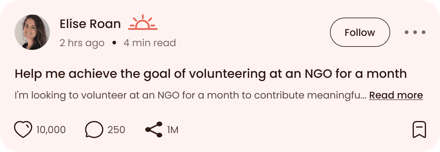
Figure : Iteration 1 Goal card (similar to article)
Problem
Stakeholder feedback stated -
“Make the goals stand out, but maintain the same visual style.”
“Make the goals stand out, but maintain the same visual style.”
Approach
Reassessed the design approach for goals vs. articles.
Realized that while the visual language could remain consistent, the content structure and hierarchy had to reflect their functional differences.
What truly matters in an article vs. a goal?
What truly matters in an article vs. a goal?
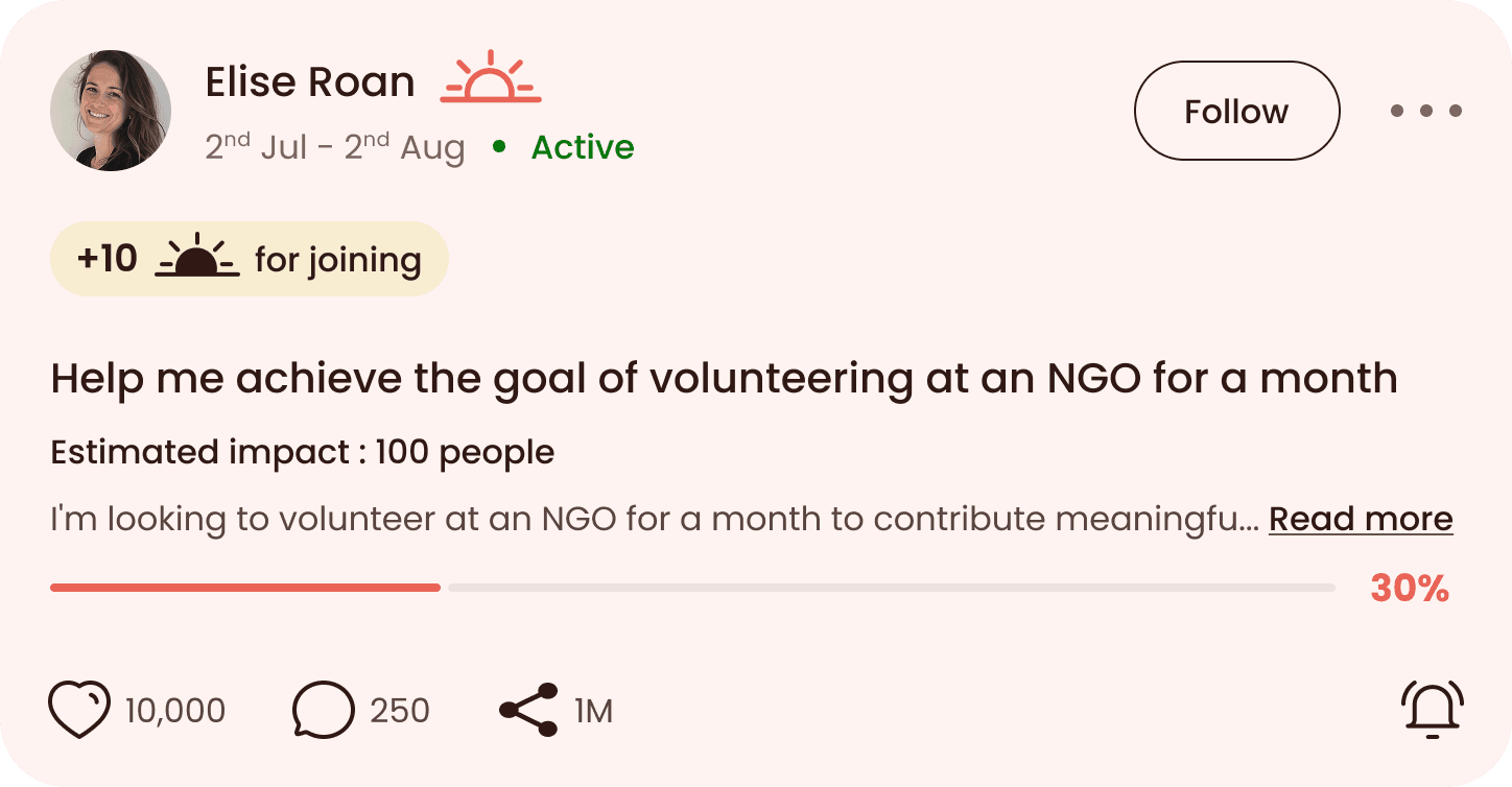
Replaced read time with active timeline to show time-bound action.
Added goal status (“Active”, “Ended”) for immediate clarity.
Introduced label: “+10 karma for joining” — a motivational trigger.
Highlights goal progress (completion bar, estimated impact)
Bookmark icon replaced with a Notify icon — aligns with the need for reminders and participation
Impact :
Increased user participation in goals
Improved content distinction and feature recall
Enhanced engagement with time-bound, purpose-driven interactions
Goal 6 : Optimizing for SEO Traffic & Creator Credibility.
Goal 6 : Optimizing for SEO Traffic & Creator Credibility.
Iteration 1
Iteration 2
SEO Optimization
One key challenge I focused on was improving how content creators are perceived — especially by visitors landing directly on articles or goals through search.
I needed to make sure every entry point built credibility, encouraged interaction and nudged them toward joining the platform.
Problem
The original article layout showed creator info at the top — in a standard, minimal format.
While technically functional, it didn’t highlight the creator’s identity or value.
As users began reading, they would often scroll past the creator section without engaging.
This was especially problematic for SEO visitors landing directly on articles, who missed the platform’s people-first philosophy.
As a result, the creator-centric nature of the platform was being undermined at key entry points.
Impact :
Boosted creator interactions mid-content
Increased SEO visitor conversion
Reinforced people-first experience even off homepage
Learnings
Learnings
Recognition is more than a reaction, it’s a system
Recognition is more than a reaction, it’s a system
Designing for scale means designing for flexibility
Designing for scale means designing for flexibility
Process doesn't have to be linear to be strategic
Process doesn't have to be linear to be strategic
Visual consistency ≠ functional sameness
Visual consistency ≠ functional sameness
Gamification isn’t enough, motivation must feel earned
Gamification isn’t enough, motivation must feel earned
Please rotate your device to view